Customize Themes for the Opportunity Directory
The Opportunity Directory can be customized or branded to match your organization's color scheme. This is a great way to unify your online presence with your organization's volunteer program. Even if your organization doesn't have a specific color palette, the theming options are a fun way to customize the aesthetics of the directory.
This help topic explains how to set or update the color theme for your Opportunity Directory. The first step is to get to the Setup page in your account used to customize the theme. To do this:
- Select Setup from the menu.
- Select Opportunity Directory - New.
- Select Theming.
The page is divided into two sections. The Opportunity Directory Theming section for setting the color of the different elements of the directory, and the Preview section to get a quick idea of how the selections look. The Opportunity Directory Theming section is on the left and Preview section is on the right. Or, when your screen width is narrow the Opportunity Directory Theming section is at the top and the Preview section is below.
Selecting a Color
To update a color, click on the field you'd like to change and use one of the following options:
- Using the Hex field, you can delete the current color, and then enter the RGB hexadecimal notation for the color you'd like.
- You can also use the color slider and color gradient to manually select the color you'd like.
- The color selector will also have a section labeled Other Colors which will show all the colors that have been selected for other elements in VicNet. If you'd like the selected field to match with another you've already configured, you can select it from the Other Colors section.
- Additionally, if you use Google Chrome or Microsoft Edge, the color selector will include an eye dropper tool that you can use to select a color elsewhere on your screen to use for that field.
If you're trying to enter an exact color, entering the value in the Hex field will give the most accurate result. Color codes are in standard hexadecimal RGB color notation. This is the color notation used in HTML (Hypertext markup language) to specify color attributes for web page elements. Hexadecimal RGB color notation includes the number sign or hashtag character (#) followed by a six character RGB color value in hexadecimal notation (hex).
Sometimes another department in your organization such as the marketing department can supply the color codes if your organization has a predetermined color scheme. If not, there are many resources available online such as the HTML Color Values page of the W3 School's website.
These are some examples of hex color notation:
#FFFFFF (white)
#0000000 (black)
#FF0000 (red)
#1D9945 (green)
If you'd rather not change each color setting separately, and don't need to match a predetermined color palette, we've come up with a wide variety of default color schemes that you can select with a touch of the button. See the Default Themes section below for more information.
Preview Color Selection
The Preview section of the page gives you a quick way to see how your color selections will appear on your directory. Because each account can be set up differently, the view is simplified. If you want to see exactly how the color selections will look, you can save your choices and then return to the page where you set up your directory. Click the Preview button in the Links section to see exactly how your Opportunity Directory will look. However, keep in mind that if you save your changes you will need to reenter the previous colors if you want to revert to what was selected before.
The Desktop view is shown in the preview by default. This is what the user will see if they're on a desktop or laptop computer. Use the menu items at the bottom to preview other views. For example, select Mobile if you want to see the color selections when the user is on a tablet or cell phone. You can interact with the preview if you'd like to see more. For example, you can select a checkbox or radio button to see how it will look when someone chooses that option.
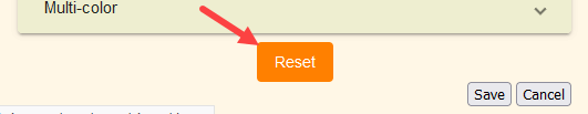
If you do not like your color choices and have not saved them, you can click the Reset button at the bottom of the Opportunity Directory Theming section to return the color selections to their previous values.
Considerations for ADA/WCAG Compliance
Your choices for the colors of the elements on the Opportunity Directory can impact whether or not the directory meets the standards for the Americans with Disabilities Act (ADA) and Web Content Accessibility Guidelines (WCAG). For example, selecting the same color, or colors with similar hues and saturation, for text and background elements will make it difficult for users to read the text or see the element.
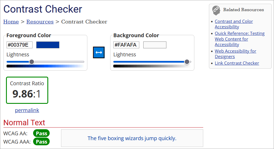
We recommend making sure your choices provide enough contrast to make them easily viewable for all users. To meet WCAG 2.0 compliance, this means a color contrast ratio of 4.5:1 or higher. There are many contrast checkers online that can help you see if your color choices have a sufficient ratio. We found a good one on the WebAIM website.
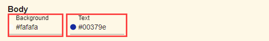
To check your choices, you just need to get the hex values for the colors of the elements that will appear on the same part of the page. For example, the Background and Text colors for the Body.
Take these values and put them into the foreground and background fields of the contrast checker. The checker will calculate the ratio so you can see if it is above 4.5:1. Here's how this looks on the WebAIM website.
Color Fields
If you're not familiar with the terms for the different form elements, it may be difficult to tell which part of the form are controlled by which fields. To help with this, we selected Midnight for the Default Theme and then selected contrasting colors for the elements.
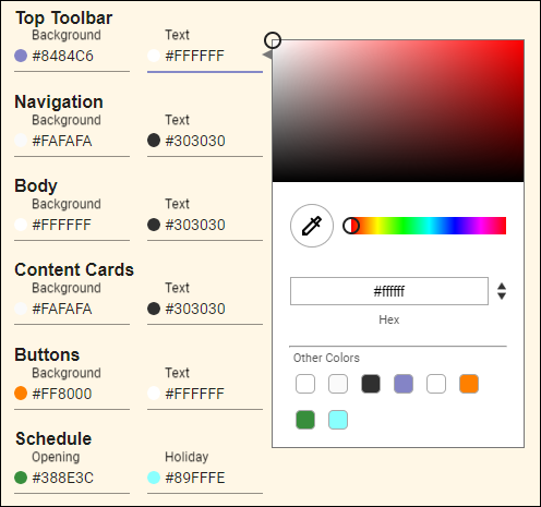
Top Toolbar
Here's where the Background and Text appear for the Top Toolbar.
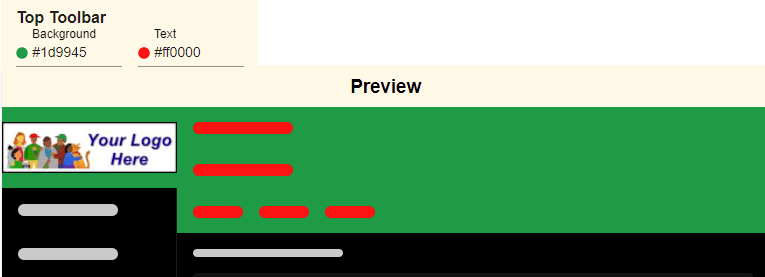
Your toolbar can also include your organization's logo.
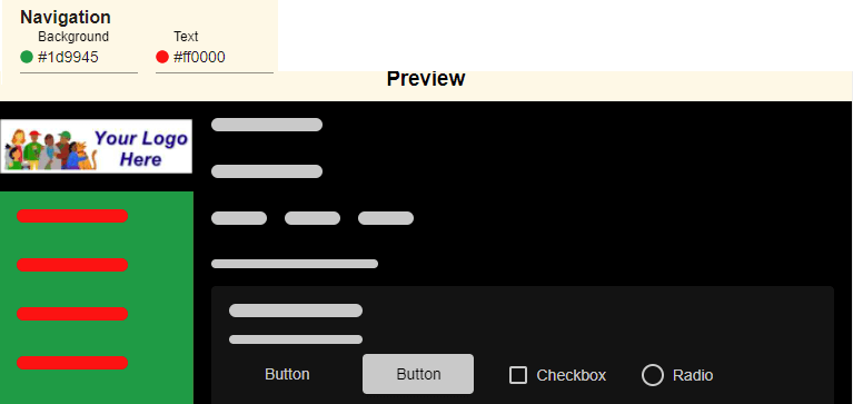
Navigation
Here's where the Background and Text fields are used for the Navigation menu.
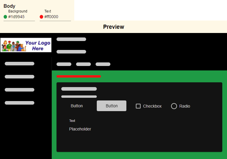
Body
This is where the Background and Text fields are used for the main body of your Opportunity Directory.
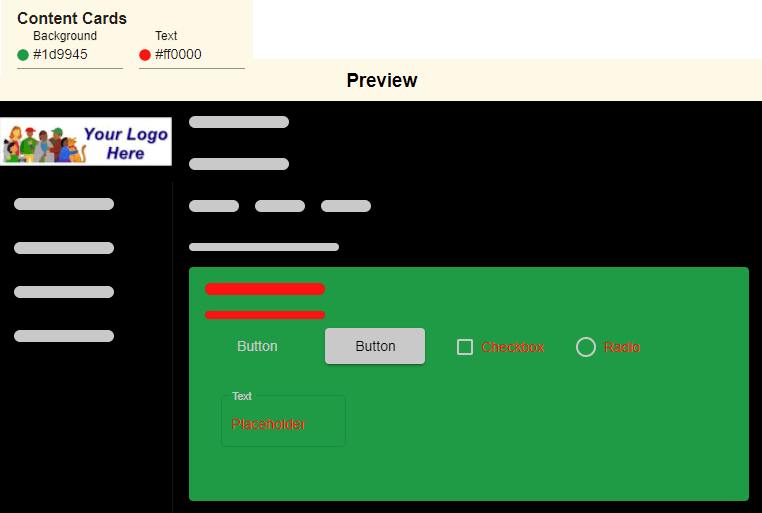
Content Cards
Similar information and fields are grouped together on the Opportunity Directory with content cards. This is where the Background and Text fields are used for the Content Cards.
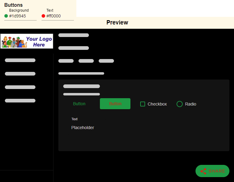
Buttons
The term buttons refers to the clickable parts of your directory. Buttons can be text, checkboxes, radio buttons, or the more traditional rectangle shape with text. In this case, the Background color choice is used for the rectangle and the Text color choice is used for the text inside of the rectangle. Here's where the Background and Text choices appear for Buttons.
Schedule
The Schedule choices control the color of the graphical elements on the Schedule page of the Opportunity Directory. When you switch to the Schedule preview the color choices are self-explanatory so we just left these with the Midnight theme's default colors.
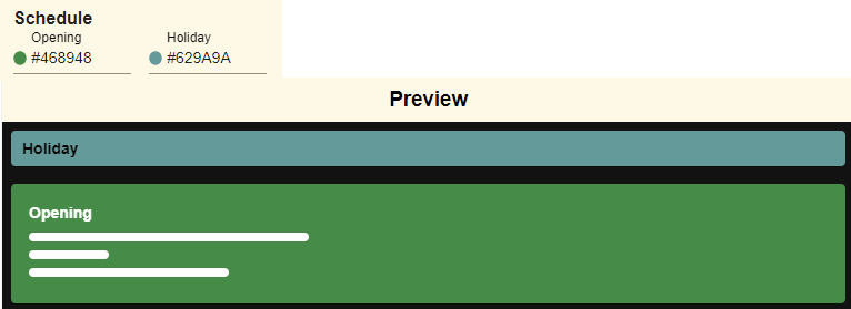
Here is what the color selections represent on the Schedule page.
- Holiday This color appears on the Schedule if the date is set as a holiday.
- Openings This color represents available opportunities where volunteers are needed based on the pre-defined schedule openings created on the Assignment's schedule.
Other
Here's where the Input field color is used.
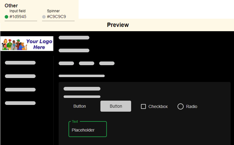
The Loading spinner color will automatically show in the Preview section when that color choice field is in focus.
Default Themes
The Opportunity Directory includes over 25 different default themes that allow you to change all of the Color Fields at once. These default themes were professionally designed with complimentary color choices to allow you to quickly select a color palette that invokes your organization's mission. You can go from sleek and modern to nautical or woodsy with just a touch of a button.
To select a theme, just expand the sections under the Default Themes heading and then click on the choices until you find one that you like. Once you've found it, save your choice and you're good to go. After you select a default theme, you can change individual color fields to tweak the appearance if you'd like.